Logo
ManuelSchoebel

Strapi Navigation Menu using Components with Next.js and GraphQL

Menus of websites can be super boring links. Or also very boring drop downs with some more links. But menus can also be much more. They can be very engaging and user friendly.

Watch the Video

We need your consent

This content is provided by YouTube. If you activate the content, personal data may be processed and cookies may be set.

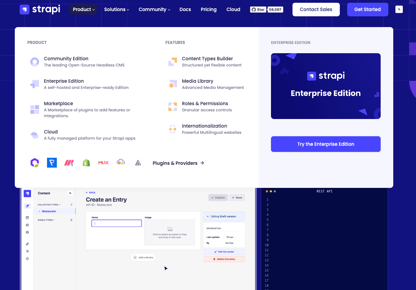
Examples of Engaging Menus

For example the menu of the website from Strapi you have a nice, engaging menu that is much more than just a few links. There is a lot going on. A link consists of an icon and a description text, which makes it way easier to understand what I can expect from the linked page.

There is also some page preview with a large image and link button.

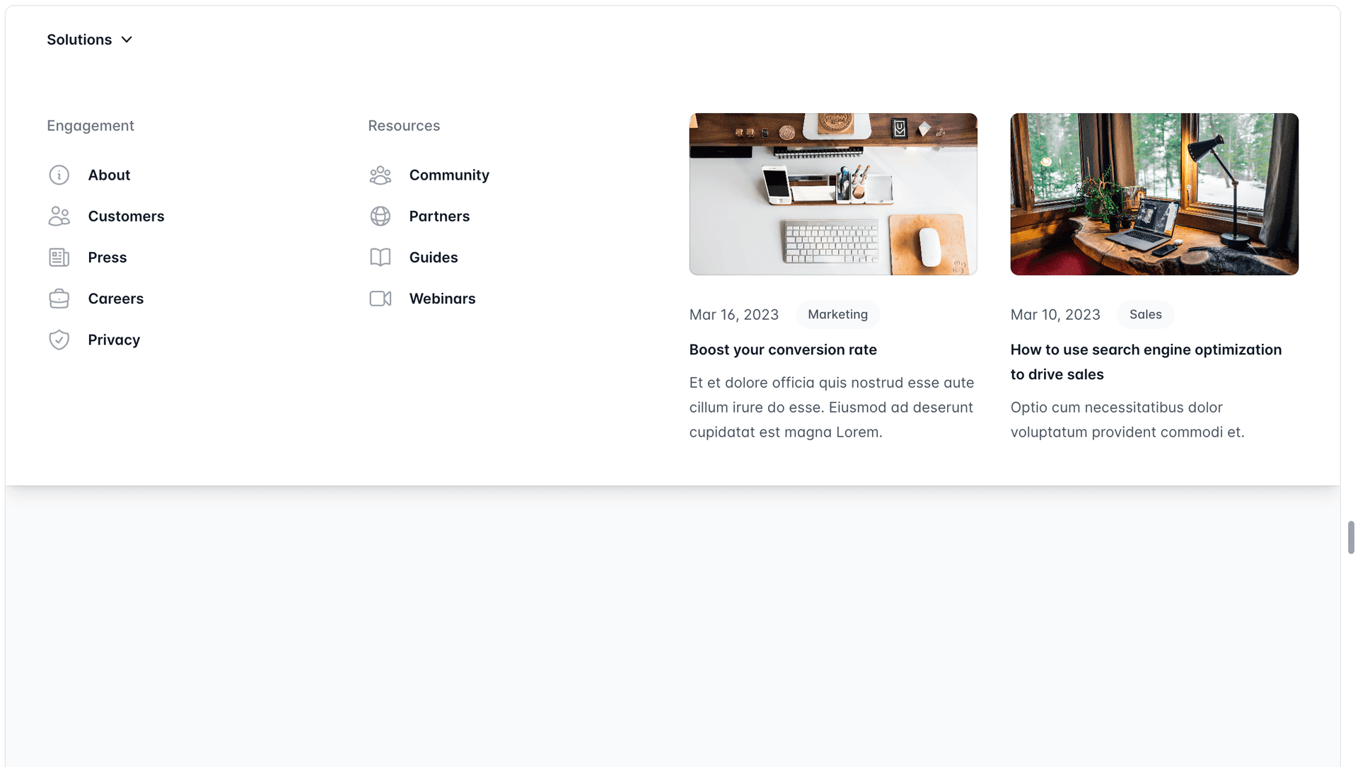
Another nice example is the fly out menu from the Tailwind components. It as well has a link list with icons and showing two page previews side by side.

Our Example Menu

The goal for this post is to look into the basics on how you can implement a menu like the ones above yourself. Using Strapi as a headless CMS the menus of course should be configurable from within Strapi, so content editors will be empowered to change those themselves.

To achieve this we will create a menu that is using Strapi components. In the end it will look something like this:

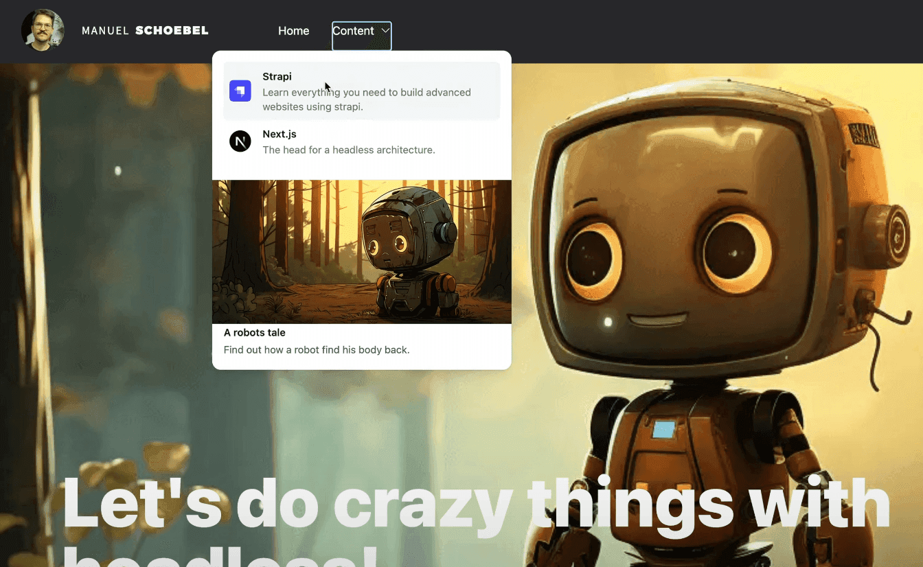
The Structure of a Menu

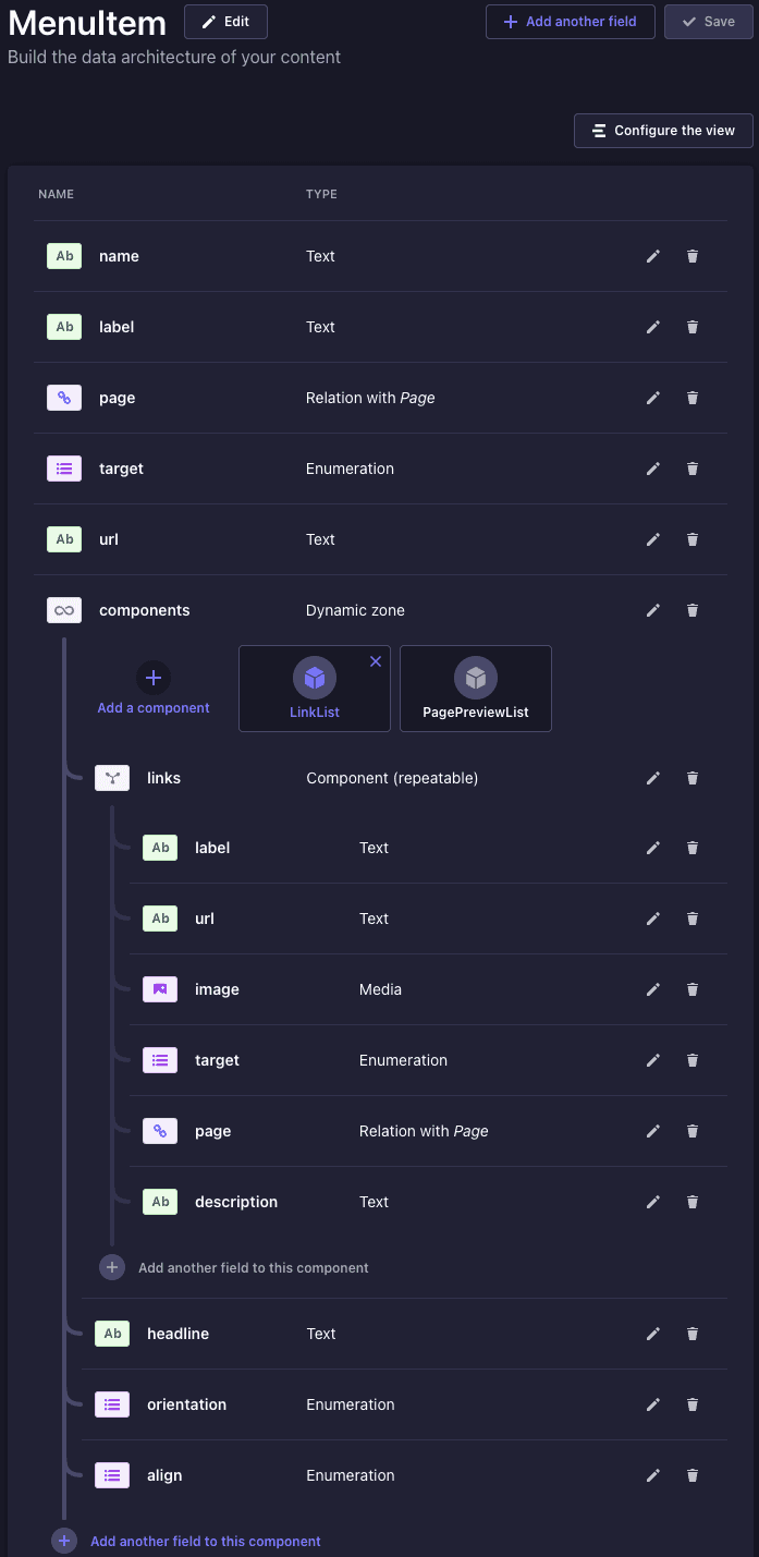
As you can see in the example above we want to have two menu items. On is called "Home" and is just a simple link.

But the second one called "Content" has a dropdown. Inside of the dropdown we will render different components.

The first component is a link list. It contains multiple links where each link has an icon, title and description text. Of course also an href.

The second component is a page preview component. This is a component that references another page. And from that referenced page it pulls that data for title, synopsis and the preview image.

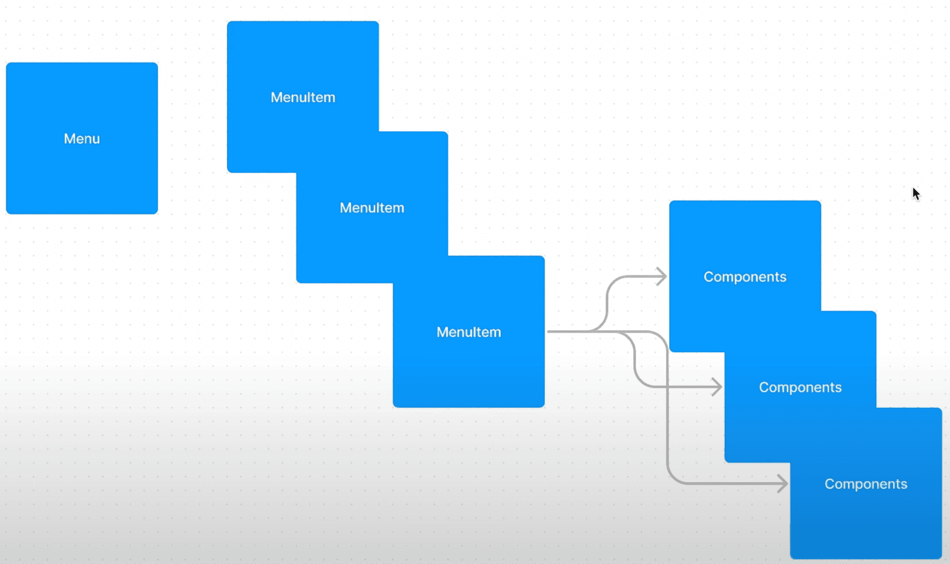
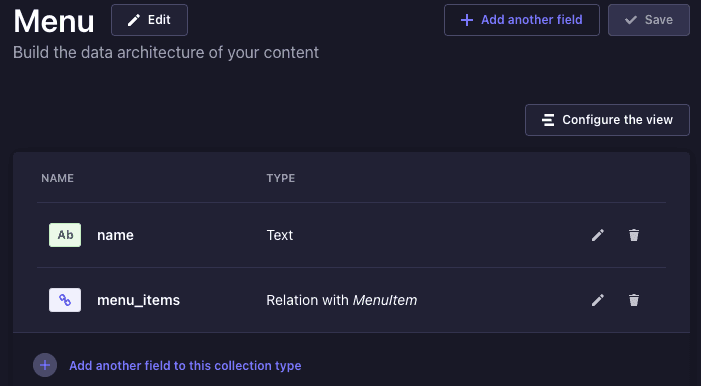
Also we want to be able to create multiple menus, not just one. So a menu will be a collection type. Menu items will also be a collection types and a relation inside the menu. A menu item then is either a simple link with a label and an href or it has a dynamic zone so we can add components. In case it has components in the dynamic zone configured in Strapi we will render the dropdown.

So on a high level concept it looks like this:

Strapi Configuration for the Menu

Let's look into the Strapi component types, menu and menu item.

Fetching the Menu Data using GraphQL

Once you created an actual menu and added some menu items, we need to fetch the data in our Next.js frontend.

We will be using GraphQL for data fetching.

I use one query that fetches all global website data, which also includes the main menu. In a simplistic version it looks like this:

query getWebsiteData($locale: I18NLocaleCode!) { menus( filters: { name: { eq: "main" } } locale: $locale pagination: { start: 0, limit: 1 } ) { data { ...MenuFragment } } global { data { ...GlobalFragment } } }

We are querying menus by its name "main" since it is named like this in the Strapi backend. For the actual data I use a GraphQL fragment. Fragments lets me structure the queries much better. Also it allows me to reuse fragments, for example for components that can be used in different places.

The fragments for the menu, menu items and components look like this:

fragment MenuFragment on MenuEntity { __typename id attributes { name menu_items { data { id attributes { label target url page { ...PagePathFragment } components { ... on ComponentNavigationLinkList { ...LinkListFragment } ... on ComponentContentPagePreviewList { ...PagePreviewListFragment } } } } } } } fragment LinkListFragment on ComponentNavigationLinkList { __typename id linkListHeadline: headline links { ...LinkFragment } orientation linkListAlign: align } fragment LinkFragment on ComponentNavigationLink { __typename id label description image { data { ...StrapiImageFragment } } url target page { ...PagePathFragment } }

This data is fetched using graphql-request in a react server component in Next.js. This way the data fetching and the rendering happens on the server side. Still the output of the website is cached and therefor very fast.

I like the simple graphql library since for mostly non interactive content pages I like to not have those crazy complicated caching mechanisms of client side focussed graphql libraries like apollo.

The query documents that are being used for the request are automatically generated using graphql-codegen.

With that the request looks as simple as this:

import { cache as reactCache } from "react"; import { GetWebsiteDataDocument } from "@/graphql/generated/graphql"; import { getClient } from "../graphqlRequestClient"; export const getWebsiteData = reactCache(async (locale: string) => { // todo: add mainMenu caching tag const client = getClient({}); const response = await client.request(GetWebsiteDataDocument, { locale, }); if (!response?.menus?.data || response?.menus?.data.length === 0) { return; } const mainNavigation = response?.menus?.data.find( (m) => m.attributes?.name === "main" ); const global = response?.global?.data; return { mainNavigation, global }; });

React Components for the Menu

Once the data is fetched you can use it in a menu component. For the menu I am using a Popover from headless ui.

The main parts of the menu are the Menu and MenuItem component. And another implementation for the mobile version of the menu, but let's focus on the desktop one.

The main idea is that you map through the MenuItem relations of a Menu. Then within a menu item you would check if it is just a link or contains components. If there are components you would use the Popover and then use a ComponentRenderer to render the components of the Strapi dynamic zone.

The ComponentRenderer is a React component that takes a map to know for what Strapi component which React component should be used. I always have a default componentMap that is used when the ComponentRenderer is used on normal content pages. But for the MenuItem I alter the configuration of the map a bit. Because in the MenuItem some Strapi components should be rendered differently than on normal content pages.

This is how it looks like in code:

"use client"; import React, { Fragment, ReactNode, useState } from "react"; import { Dialog, Popover } from "@headlessui/react"; import { Bars3Icon, XMarkIcon } from "@heroicons/react/24/outline"; import { MenuFragment, MenuItem as MenuItemType, } from "@/graphql/generated/graphql"; import { MenuItem } from "./MenuItem"; import { MobileMenuItem } from "./MobileMenuItem"; function Menu({ attributes, children, }: MenuFragment & { children?: ReactNode }) { const [mobileMenuOpen, setMobileMenuOpen] = useState(false); if (!attributes) return <></>; const { menu_items } = attributes; if (!menu_items || menu_items?.data?.length === 0) { return <></>; } return ( <div className="flex flex-grow"> {/* md Menu */} <Popover.Group className={`hidden md:gap-x-8 flex-grow lg:flex gap-y-2 h-full justify-start`} > {menu_items.data.filter(Boolean).map((menuItem) => ( <Fragment key={menuItem.id}> {menuItem?.attributes && ( <MenuItem {...(menuItem?.attributes as MenuItemType)} /> )} </Fragment> ))} <div className="flex flex-grow justify-end">{children}</div> </Popover.Group> {/* sm Menu */} ... </div> ); } export { Menu };
"use client"; import React, { Fragment } from "react"; import { Popover, Transition } from "@headlessui/react"; import { ChevronDownIcon } from "@heroicons/react/24/outline"; import { Enum_Menuitem_Target, MenuItem, PagePreviewListFragment, } from "@/graphql/generated/graphql"; import { componentMap } from "@/config/componentMap"; import { ComponentRenderer } from "../../ComponentRenderer"; import { TextLink } from "../TextLink"; import { MenuPagePreviewList } from "./MenuPagePreviewList"; import { MenuLink } from "./MenuLink"; function MenuItem({ page, url, label, target, components }: MenuItem) { const href = page?.data?.attributes?.path || url; if (href) { return ( <MenuLink active={false}> <TextLink className="px-2 py-1 hover:bg-gray-200 dark:hover:bg-stone-700 rounded-md" href={href} label={label || ""} target={target === Enum_Menuitem_Target.Blank ? "_blank" : "_self"} /> </MenuLink> ); } return ( <Popover className={`relative flex items-center`}> {({}) => ( <div> <Popover.Button className={`flex px-2 py-1 items-center gap-1 focus-visible:outline-none hover:bg-gray-200 dark:hover:bg-stone-700 rounded-md`} > <span>{label}</span> <ChevronDownIcon className={`ml-1 h-4 w-4 text-gray-900 dark:text-white`} aria-hidden="true" /> </Popover.Button> <Transition as={Fragment} appear={false} enter="transition ease-out duration-200" enterFrom="opacity-0 translate-y-1" enterTo="opacity-100 translate-y-0" leave="transition ease-in duration-150" leaveFrom="opacity-100 translate-y-0" leaveTo="opacity-0 translate-y-1" > <Popover.Panel className={`absolute left-1/2 z-10 mt-4 flex w-screen max-w-md -translate-x-1/2 px-4`} > {/* Presentational element used to render the bottom shadow, if we put the shadow on the actual panel it pokes out the top, so we use this shorter element to hide the top of the shadow */} <div className={`grid grid-cols-1 gap-6 max-w-md p-4 overflow-hidden rounded-xl bg-white dark:bg-stone-800 text-sm leading-6 shadow-lg ring-1 ring-gray-900/5 dark:ring-gray-100/20`} > <ComponentRenderer components={components?.filter(Boolean) || []} componentMap={{ ...componentMap, ComponentContentPagePreviewList: ( props: PagePreviewListFragment ) => { return <MenuPagePreviewList {...props} />; }, }} /> </div> </Popover.Panel> </Transition> </div> )} </Popover> ); } export { MenuItem };

And that's all the parts you need to create configurable and engaging menus with Strapi and Next.js.

©️ 2024 Digitale Kumpel GmbH. All rights reserved.